Yes, we are up to our eighth workshop. On the last day, I said I could not believe we had been meeting for seven years. (We did two workshops in the same year back in year three). It’s hard to believe we have just two years to go to fulfill our ten-year commitment. Although we have lost some people along the way, we had ten to eleven participants in each of our two sessions at The Oregon Garden this year. It was our second year of working with the effects of thread, specifically how thread color and/or value affects the fabric the thread is stitched on. As usual, Hollis’s lessons were more than instructive. I used the word edifying during class one day. In my previous blog, I discussed the two quilts we worked on the last three days and our assignment for the year to combine them into a single quilt using borders.
The following exercises are those we did the first two days. I realize they don’t look like much, and it may seem as if we banged them out in no time. But believe me, everyone designed and stitched like fiends to finish two assignments in the morning and two in the afternoon in time for group critiques. Was I successful in meeting the goals of each lesson? Sometimes and sometimes not. That’s typical for the class as a whole. What seems simple at the outset of an assignment often turns head-scratching, as you recognize what you are doing is not working. Sometimes you figure out why, but rarely before time runs out. But often as not, you don’t see the problem until critique time.
Lesson #1–Complementary Colors–Creating vibration with complements

Vibration with Complements
The goal was to create a fabric composition with different colors of fabric. Then use complementary colored thread to try to change the colors so they vibrate. I was trying to create vibration by stippling within the circles. It didn’t work, because I didn’t have quite the right value and intensity of color. Hollis suggested I stitch close to the edge of the circles instead, and I needed a lighter shade within the circles. Some points to remember from this lesson are (1) most vibration comes from colors in the center of the value scale. That means you cannot achieve vibration with purple and yellow, because bright purple and dark yellow do not exist. But–you can use purple and yellow to create the effect of suede or to create shade. (2) When quilting a face you must match thread value to fabric or stitching looks like a scar. But you can use any color you want!
Tone down bright colors with thread

Two purples–one light, one dark
Use the complementary color in thread to tone the fabric color down. Success!
Lesson #2–Mid-tones–How to use mid-tone fabrics and change them with thread

Mid-Tone Fabrics
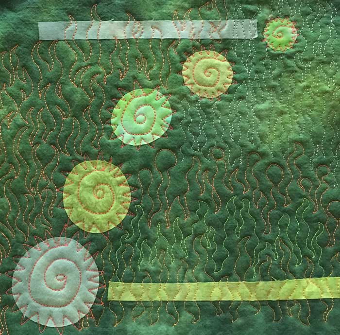
The goal was to use fabrics that flow subtly from one value to the next using only medium value fabrics. Put all of the light and dark values into the composition with thread. But–try not to create jumps from one value to the next. Plus, use one to two warm colors, and soften the edges from one to another. Wow–this was a lot to think about. My critique from Hollis: the light and dark sections worked but not overall. To soften the edges of the two greens, put lighter green on dark and vice versa, or use the complement in two values. Create lost and found edges to move the eye around the piece.
Break up a monochromatic color scheme by using thread

Monochromatic Color Scheme
My thread colors do not show so I wasn’t successful in achieving the goal. I could see my thread colors and values were not working. I tried light values. I tried the complement. And I tried fluorescent, which has worked great in the past. No go. I learned a lesson I will never forget. Medium green is the most challenging of colors. That doesn’t mean you shouldn’t use it. But it doesn’t work for some applications. Some great points beyond this: (1) Black would be the best choice for this piece. I could leave space unquilted around circles. Stitch three concentric rectangles around the top green strip to bring it forward and change the mood.
Lesson #3–Create luminous neutrals and semi-neutrals

Luminous neutrals
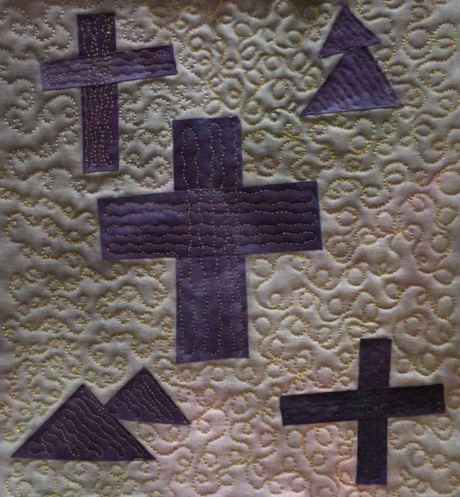
Create a composition in grays or browns and create luminosity by adding thread to it. I tried creating luminosity by adding the complementary thread (red). It didn’t work, because it wasn’t concentrated enough to make an impact, and important point, any semi-neutral color works. I went back and added the gold in the pattern shown to remind myself what worked for one of the other students.
Animate darks with lights–using dark colored fabrics that have a base color to them

Darks Animated
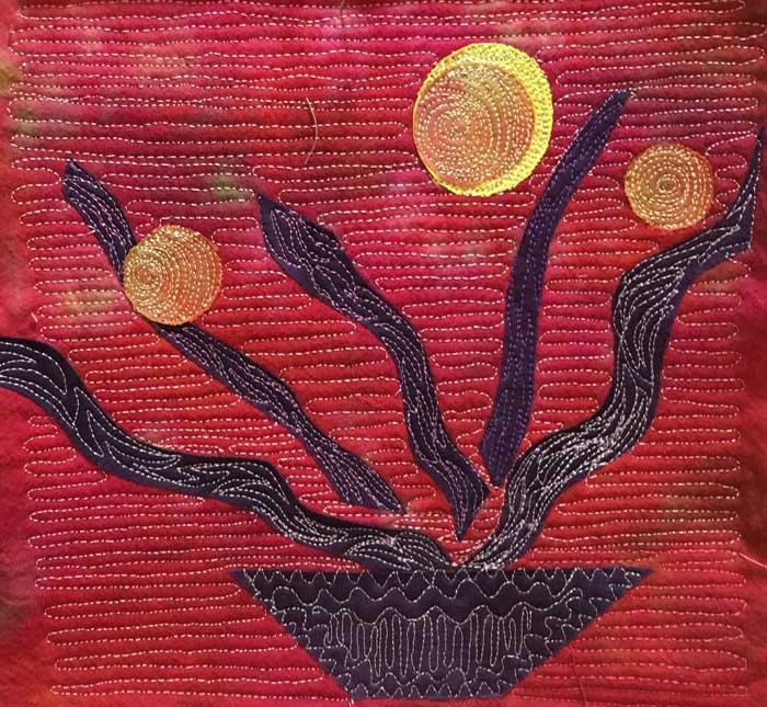
Create a small composition with only dark fabrics, except add one bright. Quilt the colors with dark pure colored threads. Use light colors alongside the dark colors. Don’t quilt everything and don’t bring everything to the same value. I liked the way this piece turned out–success.
Lesson #4–Make Colors Glow

Make Colors Glow
The goal–take a dull composition and give it a bright, fresh, or warm feeling. Experiment with thread that is lighter or brighter than the base fabric. Results–I was successful, yay, but could brighten my piece more. Points to remember: (1) vertical quilting is not as visible as horizontal due to the way light hits the piece. (2) To create glow something dark should be next to it.
Creating distance and atmosphere with warm and cool colors

Distance and Atmosphere
The challenge was to create a composition using warm colored fabrics then see what happens when thread is added in the same colors but of a cooler temperature. Successful! Point to remember: (1) to cool, you can move one step over on the color wheel. Example: go from red to purple thread but lighter color not same value.


