A couple weeks ago, I completed the ninth annual Master Art Series with Hollis Chatelain at The Oregon Garden. This year was all about neutrals and identifying our own style. Prior to class, we selected six pieces of our work: three that were successful and three that were not. Each day of the five days, Hollis assigned a new challenge. Our job was to select a piece, either successful or not, and recreate it without redoing it exactly.
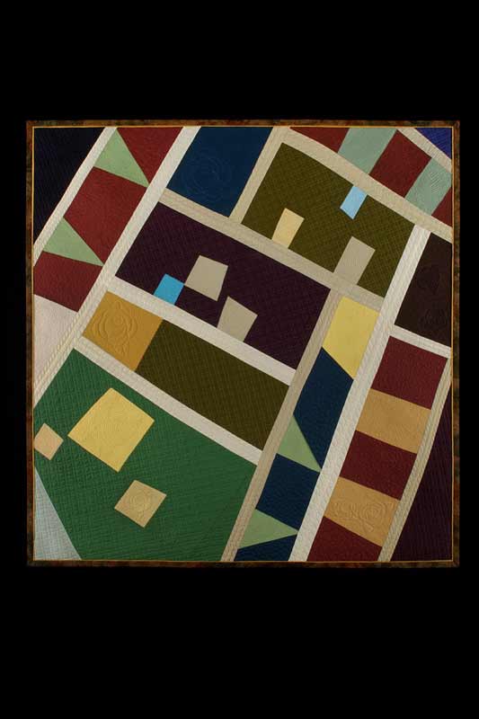
The first challenge could only be done in black and white solids and prints. No grays or creams could be included. In one way this was a challenge, because you couldn’t count on color to carry your piece. But on the other hand, you didn’t have to be concerned with color. Instead, you had to rely on value. I selected a piece that was one of three in a series. I sold the other two at my solo exhibition at The Rocky Mountain Quilt Museum, but this one remained in my collection. I hadn’t been able to figure out why it didn’t work. Prior to coming to class, we had to convert the photos of our six pieces into black and white. When I did I saw immediately the problem: little value variation. Although I had used bright colors, they were similar in value. Here’s a photo of the original piece.

Compass Points
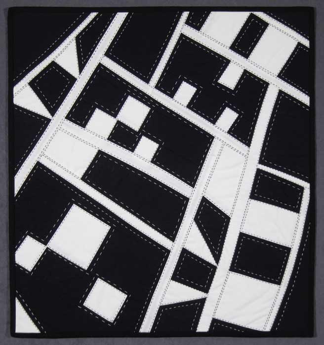
Here’s my new iteration in black and white. I was fortunate in that I have quite a few black and white prints, which create a lot of visual texture in the piece. In the color version above. I was trying to create texture, both visual and physical, with the texturing in the fabric paint, quilting and the scattered seed stitch. Personally, I like the new version much better.

Compass Points in Black and White, unquilted
Day Two we picked another piece and could use gray along with black and white, but only solids or mottled fabrics–no prints. I selected another unsuccessful piece, created it a Nancy Crow workshop. I saw it didn’t have enough value change, even though Nancy stresses that. Interestingly enough, when I first created the piece, it was originally in black and white. But when we had to enlarge it and do it in color, I think it lost something.

City Lights–Color version
Here it the small black and white original.

City Lights–small, b & w
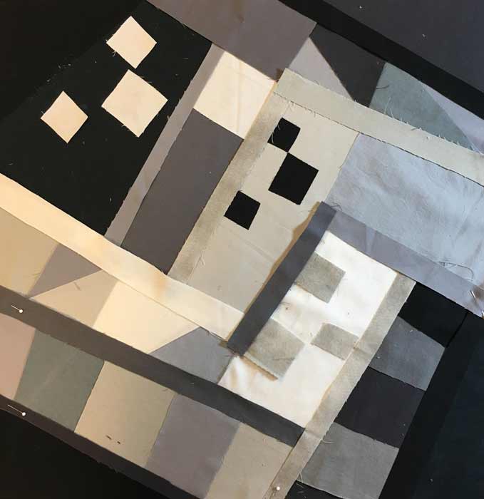
I changed the orientation for the new version. While I don’t love it, the class thought it worked.

City Lights–black, white, and gray, unquilted
You will notice the pieces are not quilted and the one above is barely together, some areas are held with pins. We had a little over four hours to complete each piece. That may seem like plenty of time, but of the five days, day one is the only one in which I completed my piece on time. It came together easily, while the other four days seemed a struggle, which is the way art goes.
This is just a sampling of what we did. We’ve been asked to wait to show work on Facebook and other social media sites until everyone in Hollis’s classes have completed this particular workshop so they won’t be influenced.
It was a very instructive week. My first two days were successful, the last three less so. And that’s the way it seems to go for everyone each year. You might think that would be discouraging but no. Instead, you take away what you’ve learned from the exercises and apply it to your work to make it more successful.
Year Ten, our final year, unless the group decides to go on, will be devoted to creating the effect of light with fabric: transparency, translucency, and luminosity. The first day will be instruction and exercises. The last four days are working on a piece of your own choosing, incorporating one or more of these effects. Should be interesting as usual. If you have the opportunity to join one of Hollis’s ten year programs, I urge you to consider it.


