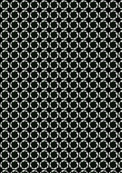
I mentioned in a previous post I was taking an on-line course called Digital Design from the Pixeladies. The ultimate goal of the course was to use a tablet and Photoshop Elements (PSE) to design fabric that you could have printed from one of the on-line printing companies, such as Spoonflower, or at home using a large format printer. While that was a good goal, mine was to gain confidence and skill using my Wacom tablet and PSE to design my art work. Up to this point, I draw everything out by hand. That means there are many erasures as I’m working on my composition. Then when I want to make something larger or smaller or repeat design elements, I enlarge, reduce, and copy using my computer printer. While none of this is so hard I can’t manage it, I knew there was a more efficient way.
The Pixeladies course is broken down into four parts: line, color, shape, and texture. Throughout the four weeks, I’ve learned how to set functions on my tablet and stylus and use the various areas of PSE, including the tool bar, layers panel, history, filters, and way more! In fact, I have to admit that while I’ve learned a great deal, I have so much more to learn. In talking to another student a few days ago, we both agree it challenging to recall all of the steps in each of the nineteen lessons. Fortunately, Pixeladies publishes a handbook to accompany the course.
Here are just some of the examples of the lessons I completed.
- The only photograph supplied during the course was one of nail polish bottles. (For the rest of the lessons we used our own photographs or created original designs). We traced the bottles, then filled in with our own color choices and textures. My colors are somewhat neon.

Bottles–traced and colored
2. We learned to put text on a line. Here’s the simple example.

Text-on-a-line
More complex. The butterfly border is done using the scatter setting.

Text on a line
I used a bullseye gradient in this example. Notice how the gradient affected the color of the border.

Text on a path variation
You can put several gradient variations with the same piece.

Text on a path gradient variation
3. Positive/negative images. I combined a flower and leaf image available in PSE.

Positive/negative flower pattern
Then we learned the steps to make the image into a repeat for a background or fabric design. This is pretty busy, but the idea is to learn how.

Flower/leaf repeat
I wanted to do something more fun with this. So I have two versions of Happy Feet in grass. Notice the difference it makes when you extend the border not to mention change color.

Happy Feet

Happy Feet Two
Here are the repeats. What I found truly interesting was how this design, when repeated, looks as if the vertical lines are bending.

Happy Feet repeat

Happy Feet Two repeat
4. We learned to use adjustment levels to change color and intensity of our own photographs.

Autumn leaf
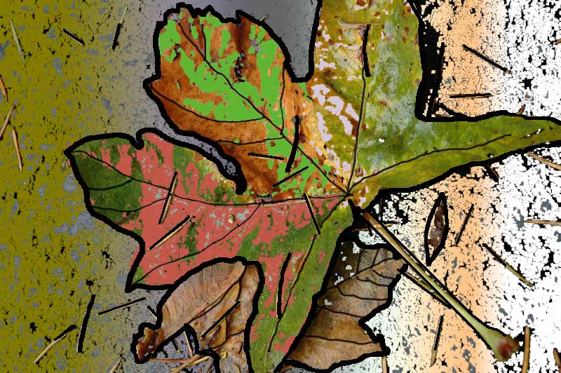
Here’s another version of the same leaf where I made a number of changes and included a line drawing around the elements.

Leaf with Lasso tool, paint bucket, and gradient
And here it is in technicolor. The point of all of this, is look at how many things you can do to achieve totally different moods to a single piece of art.

Techni-leaf.
5. Here’s a piece I did using nothing but shapes available in PSE. It’s a good example of a graphic design image.

Graphic shapes.
More use of the shape tools.

Shape Tool example
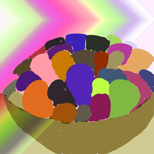
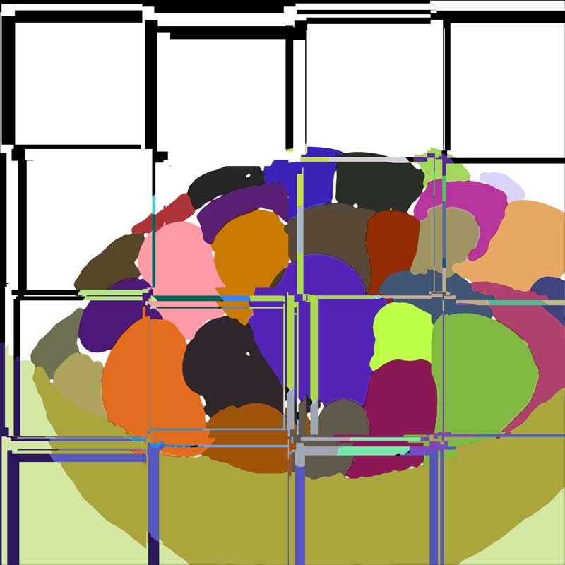
6. Lastly, I chose a photo of wool cylinders in a bowl and played with it using custom shape tools and the lasso tool to fill in color, followed by filters that distort and change your images in unexpected ways. The results can be strange or happily serendipitous.

Wool basket painted with background gradient

Wool basket tiled three times

Wool basket altered with filters
I highly recommend this course. This was the first time Pixeladies has offered it, and I don’t know when they will again. I will most likely take it a second time as a refresher. You should also know if you aren’t well-versed in Photoshop Elements, they teach PSE I and II on-line, which you should take prior to Digital Design.


